This is my first blog and here I am starting with absolutely zero experience, writing on the famous album Dark Side of The Moon. One of the most influential album covers is the prism logo that appeared on Pink Floyd’s Dark Side of The Moon, 1973.

The album, one of the greatest hits ever to be released sold over 10 million copies worldwide and topped the Billboards chart for more than 10 months, placing itself above Elvis Presley and Bob Dylan’s records. It is rather a blasphemy when people commit this mistake of confusing the album cover by calling it Pink Floyd’s band logo. Not an act of disrespect it is, but an act of sheer ignorance on the part of a Floyd lover or an overall music lover.
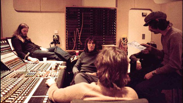
Pink Floyd never had a logo, for the record. They had this band text or calligraphy, the words Pink Floyd written in a jagged manner. The prism logo, designed by Mr Storm Thorgerson, was basically dedicated to ex-bassist and former founder member Syd Barrett. His accounts of insanity and disillusionment has been of great significance in the writings of Roger Waters. Waters has dedicated most of his songs to Syd, or rather took the ideas and influences from Barett’s mental instability.

The penultimate track of the album, Brain Damage, talks about a “lunatic”. Floyd fans have questioned the identity of the lunatic, some stated that its the politicians, while some said that Waters talked about his children here. Few went a step ahead and said that it was his wife. Few years later, all discussions and debates were written off as David Gilmour made it clear that the lunatic was the former band member Syd Barrett. Waters clears throat on the account of influence from Syd with the lines,
You raise the blade, you make the change
You rearrange me till I’m sane.
Note the irony when he calls for a ‘lunatic’ to rearrange and restore his sanity.
The album art has got a significant impact on the lives of music lovers and die hard Floyd lovers. They worship this cover art. Graphic art designers from all over the world have rendered their own touches to the album art. The very concluding lines of the album and the logo, speak a lot about life in its darker ways. Speaks of death, war, lunacy, drug effects, sloth and the ill powers of financially strong individuals. Through out the whole album, lingers a ray of hope. They call it the “Dark Side” of the moon, leaving a lone possible hope that although one side of the moon is dark, there’s light on the other side. At the very last stanza, Waters kill it quite subtely in the form of a barely audible voice that blurs through the background while the band is playing the concluding bars of music. Feebly, the baritone mutters,
There is no dark side really,
Matter of fact, its all dark.
The logo, according to Mr. Thorgerson, depicts the darker ways of life. The white light that passes through the prism divides into bright colors but there lies a matter of scrutiny. The light shades get darker, as you move up the colors that run. This signifies life, the sorrows grow and worries multiply as we get old every day.
No other pink floyd album has ever been so influential in our lives. The first picture that we paint in our minds as we hear the word Pink Floyd is the picture of a white light, passing through a prism and then dividing into the colours of a rainbow. It is one of those very few album covers that actually give the album a face, an entity. Such similar albums are Help (The Beatles), Abbey Road (The Beatles), The Wall (Pink Floyd), 2112 (Rush), Use Your Illusion (Guns N Roses), Slippery When Wet (Bon Jovi), Metropolis Pt. 2 ( Dream Theater), Number of the Beast (Iron Maiden), etc.
This album design has been made and remade by various other graphic designers all over the world.

